
The illusion of depth in art
The illusion of depth in art
Trying to make 3D into 2D

This post shows the challenges and dilemmas of representing reality in art, and the challenge of representing real things in any form of symbolic language.

Creating the perception of depth in paintings, sketches and photographs is a challenge, one that cannot be completely solved. This is because depth is three-dimensional, while a sketch, photographic image or painting is two-dimensional. Three-dimensional depth cannot physically exist in two dimensions. If you hold a crystal clear family snapshot of the Grand Canyon in your hand, at least logically you know that distant cliff and cloud are not miles behind your hand. You know it is just an image on the surface of a flat piece of paper.
Over the centuries artists have developed techniques to create the representation of depth in 2D art. Before these techniques, paintings, and sketches lacked any sense of depth. Cave drawings appear primitive as the artists didn't understand the standard concepts of depicting depth. A European painting from 100 AD shows objects in unreal proportions to each other. A mile away person may be the same size as a person two feet away.
This post looks at several standard techniques used to give paintings, sketches, and other 2D art the illusion of depth. These are techniques you can observe in art and incorporate into your art. These are also 'techniques' you can observe in real life, such as when looking at your living room or across your backyard. After all, the art is attempting to duplicate natural scenes like these.
.
Overlapping objects
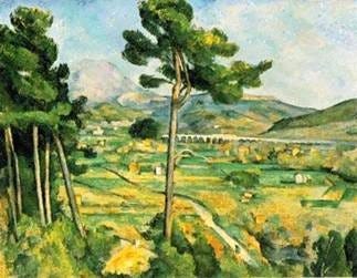
An object appears to be in front of the object(s) it overlaps. Overlapping is the strongest indicator of relative distance, overriding all other signs when there is seeming conflict. In the above Cezanne painting, the large center tree overlaps the 'distant' bridge, mountain and sky.
.
Diminishing sale
With things that are believed to be of the same of similar size (2 cats or basketballs), the larger appears to be closer than the smaller. In the Cezanne painting, the viewer assumes that the tree is much smaller than the distant hills. Thus the difference in scale (the tree taking up more space than the hills) makes it appear as if the tree is closer. In the earlier Raphael painting, the smaller people appear to be farther away than the larger ones. This is because the viewer is under the assumption people are of similar size.
.
Diagonal lines and diminishing scale
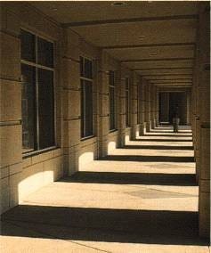
An exemplification of diminishing scale, diagonal lines moving towards each other as they move up or down a painting or sketch give the illusion of depth. A real-world example of this is a straight road that becomes visually skinnier as it approaches the distant horizon. Another example is standing at one end of an empty hallway and watching the lines where the wall and floor meet visually move toward each other as they move to the other side of the room.
.
Colors
In art humans tend to perceive bright, warm colors like red, orange and yellow as being close, and dark, cool colors like blue and dark purple as being further away. This is particularly true for abstract art.
For landscapes, adding blue will make hills and mountains look more distant. The further away the bluer. This is because the color changes as it goes through more and more atmosphere.
Bottom-to-top placement
Barring conflicting information, humans generally perceive what is at the bottom of a painting to be in front, and what is at the top to be in the back. This is particularly true when looking outside where there is no 'ceiling.'

Inside a building, the ceiling can have the opposite effect, with the ceiling area nearest you appearing higher than the ceiling area further away.

Similarly, objects that have more intense color, detail and contrast often appear closer than objects that are blurrier, hazier and have less focus.

.
Final notes
Many visual illusions manipulate these techniques. The illusions often use incongruous, logically conflicting techniques to toy with our minds. One quality indicates one, while another will evoke the opposite. One quality will evoke flatness, while another will evoke great depth. The discord produces emotional reactions in the viewer. The illusion will appear 'impossible' or 'illogical' to the viewer.
The natural signs of depth can also fool us in the real world. Nature itself can give conflicting signs … High in the mountains beyond the haze we are used to, climbers often misjudge distance. The mountain miles away is clear and unhazy and appears much closer than it is. Climbers are often warned of this before the climb, as the illusion can be dangerous.
.
A problem in trying to create realistic depth in two dimensions is that the human is designed to detect real depth not a flat representation. Looking at the real backyard, each eye looks at the 3D objects from a different angle, the head and body movements creating even more perspectives. The mind combines these different views into the mind's image.
This cannot be done with a two-dimensional object. With a still-life painting and even a still-life photograph, the eyes can't get the different views of the apple that is needed to perceive a truly 3d orange. The photograph, no matter how clear, shows only one perspective.
Notice that many attempts to create a closer to true 3D effect involve an alteration not just to the flat image but to the viewer's vision. 3D movies and pictures often require special glasses and viewers.
The hologram is a rare example of a flat image that can realistically simulate three dimensions, even allowing the viewer to see different sides of a pictured object.
.
Picasso and cubism
Picasso said he wasn’t always trying to make a beautiful work– his focus was sometimes on other qualities and things–, and he considered the expected cliched commentaries about the work’s beauty, or lack thereof, to be missing the point.
Many of his cubist works try to depict three dimensions in a two-dimensional plane– an aesthetic and philosophical dilemma that exists in all two-dimensional artworks. Some of his cubist works tried to depict the passage of time in a still image– another interesting and unsolvable aesthetics problem that exists in all still art, even so-called realistic art.
I don’t like Picasso on the ‘pretty’ level and wouldn’t hang one on my wall, but his works bring up significant philosophic, aesthetic, and cognitive science questions. All human perceptions and representations of reality are limited, distorted, and filled with paradoxes, and his is just a different representation from a different informational angle. So-called ‘realistic’ art is filled with smoke and mirrors, tricks, and visual illusions.
If one looks at Picasso's work as a philosophic thing, the question of “Is it beautiful or not?” becomes “Is whether or not it’s beautiful a relevant question?” Many artworks are trying to express something other than beauty. Munch’s Scream is trying to express something other than beauty– and most would say it does a good job at it.
Further, it begs the question of ‘Is it art?’ a worthwhile question.